
Colour is one of the first things people think about when designing a space.
But it is also one of the easiest places to go wrong.
Many people choose colour too early. They start with a paint swatch, a Pinterest image, or a trend, before understanding the room itself.
At NIZARRA, we believe colour should not be chosen in isolation.
It should respond to the space.
Start with the room, not the colour.
Before choosing a wall colour, look at what is already happening in the room.
Ask:
What kind of natural light does the room get?
Is the space warm or cool during the day?
Are the floors light, dark, red-toned, grey-toned, or yellow-toned?
What large furniture pieces are staying?
What mood should the space create?
A colour that looks beautiful in one room can feel completely wrong in another because the light, flooring, furniture, and proportions are different.
Colour must work with the architecture of the room, not fight against it.
Understand the feeling you want to create.
Colour is not only visual. It changes how a room feels.
A soft neutral palette can make a space feel calm, open, and grounded.
Warmer tones can create comfort and intimacy.
Darker colours can bring depth, drama, and a more cocooned feeling.
Earthy tones can make a space feel rooted, natural, and timeless.
Before asking, “What colour do I like?” ask, “What should this room feel like when I walk into it?”
That question usually leads to better decisions.
Pay attention to undertones.
One of the biggest colour mistakes happens with undertones.
A beige is not just beige. It can lean yellow, pink, grey, green, or brown.
A white can feel warm, cold, creamy, stark, or chalky.
A grey can turn blue, purple, or flat depending on the light.
This is why colour should always be tested in the actual room before committing.
Look at the sample in the morning, afternoon, and evening. Colour changes throughout the day.
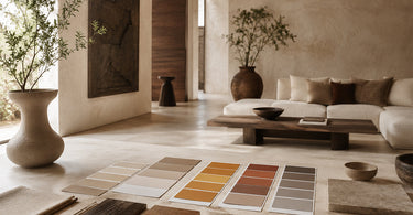
Build a palette, not a single colour.

A room does not need one good colour. It needs a complete colour relationship.
Think in layers:
Your main colour
Your secondary colour
Your grounding neutral
Your contrast colour
Your material tones
Your metal or wood finishes
A beautiful interior usually works because these colours are speaking to each other.
The wall colour, rug, curtains, artwork, furniture, and accessories should feel connected, even when they are not identical.
Use colour to correct the space.

Colour can help solve design problems.
A small room can feel more expansive when the palette is calm and continuous.
A room with too much visual noise can feel more settled with fewer competing colours.
A cold room can feel warmer with earthy, clay, ochre, cream, or brown-based tones.
A flat room can gain depth through contrast, texture, and tonal layering.
This is why colour should be part of the design strategy, not just decoration.
Avoid choosing colour from trends alone
Trends can be inspiring, but they should not lead the entire project.
The right colour for your space depends on your light, your materials, your lifestyle, and the atmosphere you want to create.
A trending colour may look good online but feel completely wrong in your home, office, Airbnb, or hospitality space.
Good colour decisions last longer than trends.
The NIZARRA approach to colour.

At NIZARRA, we approach colour through the full spatial system.
We look at:
Light behaviour
Proportion and scale
Material finishes
Visual weight
Furniture and object placement
The atmosphere the space needs to hold
Colour is never just a surface decision.
It is part of how the room is read, felt, and experienced.
Final thought
Choosing colour is not about finding the “perfect” shade.
It is about creating a palette that supports the space.
The best colour choice is the one that makes the room feel more resolved, more balanced, and more intentional.
Before you paint, buy, or commit - read the room first.
NIZARRA
Rooted in culture. Designed for space.